
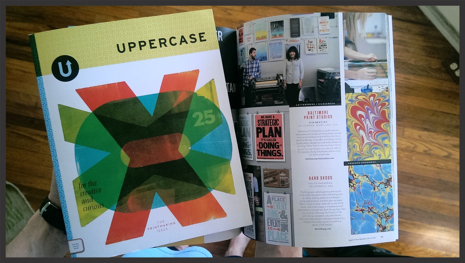
Yay! My copy of Uppercase magazine arrived this weekend and I immediately dove in to check out all the wonderful printmakers featured...including yours truly!
The issue is, once again, a feast for the eyes and the creative soul. Uppercase publisher/editor Janine Vangool does an amazing job on design and I'm always impressed with the quality of the writing. It was an honor to be included amongst the magazine's pages.
This issue also included an insert from one of the printmakers featured ~ including moi.I originally committed to doing 25 inserts but then I had so much fun making them, I didn't stop! One hundred lucky subscribers got one of my original, hand-marbled pieces seen below!
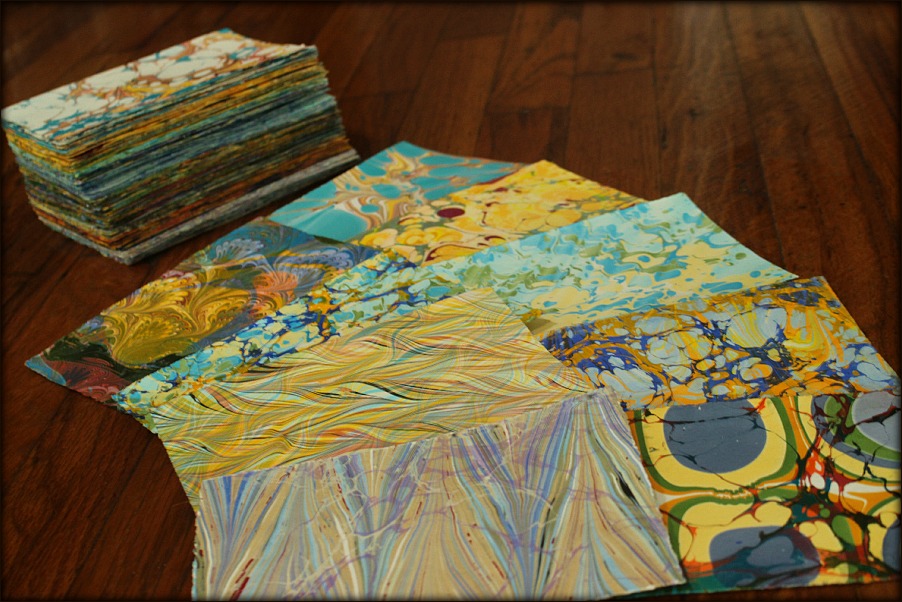
My hubby nicknamed these 4"x6" pieces "Marbel-itos," which I find completely endearing. They've been a hit with those who received one in their issue; I've gotten enthusiastic thank-you emails and several very kind Instagram nods.
I knew I wasn't the only one who had a mad crush on these little gems.
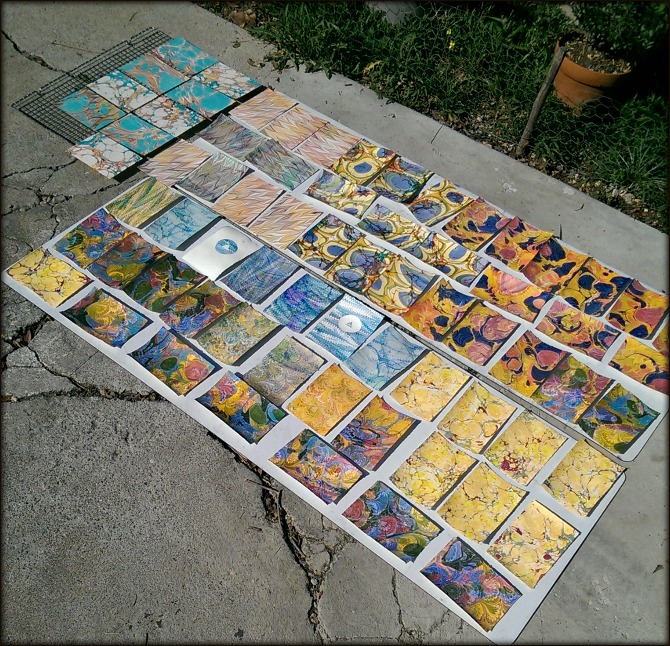
So, I figured what better way to celebrate being in Uppercase than to create more Marble-itos!

Marbled on hand-torn (deckled edges), thick and dreamy creamy, 100% cotton rag paper, Marble-itos measure approximately 4"x6". Each one is signed and numbered (1/1) on the back. I have them for sale in my shop for $15 + FREE SHIPPING + a surprise bonus gift!!
And a celebration wouldn't be a celebration without a giveaway! Leave a comment on this post (or just say hi!) by midnight tomorrow (April 21) for your chance to win your own Marble-ito and surprise bonus gift!


 I love the colors red and yellow together. As a kid, I used to pull out the yellow and red M&Ms and make a little pile of them off to the side. I'd then greedily eat all the other colors while saving the yellow-red pile for as long as I could.
 I figured it was only appropriate that the header for this month comes from one of my images that appeared in the

